Image Map

GCD + Some Beach fun

     Hey there friends! This month the GCD blog is focusing on all things summer. From waves and splashes to palm trees and souvenirs, were going to show you how to incorporate two of  fun lines in your paper-crafted projects! Today I am going to show you two cards that celebrate one of the most-traveled to summer locations; the beach!


 I try not to go for the most obvious ideas, so I stayed away from sun, surf, beach balls and beach castles. I had this adorable little bathing suit cut file, so I die cut the suits using paper from the Oh Happy Day collection and strung them on some baker's twine! 

I love dimension and popped some of the suits up with foam tape! This card would be perfect to give to a girlfriend ready to sport her new suit at the beach! The next card
 is a little bit more my girlfriends and I! 


Okay, I don't have kids and I hate getting sandy, so my idea of beach fun is sipping a tropical drink while soaking in the sun! I die cut some umbrella drinks using patterned paper from the Flower Child collection. I love love love this collection, especially it's bright colors and geometric prints!

Too add a little dimension, I added some funky ribbon and popped the umbrellas up with some foam tape!

Well, that's it for me today! Check the blog for more amazing ideas and projects all month long!


Supplies: "Lovely Suit" Card: Oh Happy Day collection: Mira's Pearls (1764), Alicia (1765), Chloe (1766), Hailey (1767), Priscila (1768), Amber's Ave (1774). Other Supplies: Sentiment (Studio Calico). Dye Ink (Tsukineko). Pearl stick pin (Maya Road). Star punch (Epiphany 
Crafts). Baker's twine (Creative Impressions).
"Happy Hour" Card: Flower Child collection: Wondering Geo(1638), Flowery (1641), Groovy (1642), Hippie Plaid (1643), Layered Geo (1644), Peacock (1646), Striking Stripe (1647), Twisted Floral (1639). Other Supplies: Sentiment (Paper Smooches). Dye Ink (Tsukineko). Pearl and crystal (Queen & Co). Orange twill. Turquoise dot (Bo Bunny).

SEI + A Gift Box Trio


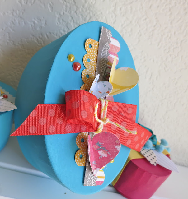
     Hey there! I love using SEI papers and embellishments to doll up simple items, like this little gift box trio! With a little paper, some fun sparklies and cute little die cuts, you can take a plain blah box and give it some pizazz! Let me show you how.

     First you'll want to paint each gift box with two coats of Acrylic paint. The fun begins when they're completely dry! For this box, I started by trimming SEI's Jimmies N Cream from Vanilla Sunshine, and then added some strips from Vanilla Sunshine Borders. After the base is adhered to the box, punch hearts from Lemon Breeze and paper from the 8.5" x 11" Card Making Pad, fold in half and adhere. I then took some polka dotted trim, wrapped some yellow and white string from sundries around the dotted trim and affixed it to the box. Finally, you can add some pearls!

    I love the dimension you get from folding up patterned paper and adding pearls and ribbon.

     This box is a little bit smaller than the box above, but bigger than the cute little pink box. I wanted to play around with the negatives of a punched shaped. First, I trimmed some ribbon and adhered it to the box, then I trimmed a block of Perennial Wish with decorative edge scissors and adhered it to the box. After, I punched hearts from Marigold Dreams and adhered it to Perennial Wish, adding a cute little rick rack trim of patterned paper. I added some more hearts using Lemon Breeze and paper from the 8.5" x 11" Card Making Pad and added some hand cut leaves from fabric swatches found in Vanilla Sunshine Coordinates.  Finally, I rolled some flowers from ribbon trim, adhere some sparkly brads from sundries in the center of the flowers and finished it all off with some pearls.

     This little pink box is super sweet and very easy to make. Add some yellow ribbon trim, some hand cut leaves from fabric swatches in the Vanilla Sunshine Coordinates and  hand-rolled flower with a sparkly brad in the center from sundries.


     The fun thing about this gift box trio is you can simply change the paint colors and switch out the patterned paper and get a completely different look!

Paper Crafts Magazine Card Design Handbook WINNER

     Hey there friends! Thank you SO very much for ALL the sweet compliments about my cards---made my day! I have a winner today, and hopefully they check today so that they can get a copy of this great issue.

Kathy/NorthCarolina said...
The leaves make a huge difference! Love the green ribbon, too!
August 25, 2012 4:18 AM


     Email me at queenerh@yahoo.com with your address, so we can get your issue to you! Thanks everyone for blog hopping!

Paper Crafts Magazine Presents Card Design Handbook Blog Hop


     Hey there friends! Thank you for stopping by Paper Craft Magazine's Card Design Handbook! This special issue is DEFINITELY one you need to add to your collection! You're going to find all the major design principles and fundamentals of art easily explained with helpful tips and ideas to make your cards go from good to GREAT!! As an art teacher who teaches the principles found in this special issue to my students, I was so excited to participate in an issue that applied these principles specifically to paper-crafted products! One of my favorite features of Card Design Handbook were the good-to-great cards found on pages 9, 34 and 66. Two cards are presented that are exactly the same, except one follows the design rules found in the Card Design Handbook glossary, which you can download for free, that makes the card design go from good to GREAT!
     So, today's blog hop focuses on how to make your design go from okay to SUPER SNAZZILICIOUS. I decided that I wanted to focus on how to achieve balance in your designs using hard and soft elements. According to the  Card Design Handbook glossary, " For every hard line or edge you place on a card, the design is balanced by some softness, whether it be from a texture (like a ribbon) or a shape (like a circle); too much hard or soft might not work." With this knowledge in mind, here is my "GOOD" card:
Hard elements are found in the lines on the patterned paper and the washi tape. The tape has been trimmed with decorative scissors that also create a hard line. Other hard elements are the pearls and embossed detail. While this card has some pretty, soft flowers, it does seem "unbalanced" according to the hard vs. soft rule.

Balance is achieved in the  "GREAT" version of this design. By adding some soft polka dot ribbon trim and adding some stamped leaves to the card, the design finally feels like it's achieved balance and has gone from good to GREAT!

Make sure to stop by the wonderful ladies' blogs who are participating in this hop, and leave a comment for your chance to win a copy of  Card Design Handbook. I will pick a winner on Tuesday, August 28th, so leave your comment on my blog before then!


Your next stop is the lovely, Vanessa Menhorn. She creates such elegant projects, so you're in for a treat!

Avocado Arts + End of the Summer

     Hey there friends! Here to share with you one last card using the totally adorable set, Perfectly Perfect Day!

 I stamped the tree several times, but ghost-stamped one tree to give the stamping some depth.

I love the cute clean lines of the tree and tree foliage! Adding some hearts with foam worked perfectly with this stamp set!

Well, that's it for me today! Make sure to visit the rest of the crew to see the fabulousness that they've come up with

Emily Leiphart

GCD + A Color Combo!


     Just wanted to share a couple of cards of mine that appeared in GCD's The Paper Cut, a free monthly e-zine filled with ideas for layouts, cards and projects as well as tips, tricks and techniques. My challenge was to create cards using pink, yellow and aqua.
Soft yellow lines provide a background of movement for the fun polka-dotted stars of pink and turquoise (an aqua tone). By using a color's tints (light hues) and tones (dark hues) you can help you get more mileage out of several colors.

Since lines are usually a strong and hard element, I used polka dotted paper
 from Flower Child to soften the design of this card.

A fun trend in paper crafting right now is confetti. I created confetti by punching circles of patterned paper from Flower Child and Oh Happy Day, and arranged them on the card to create some movement!

Well, that's it for me today! Check the blog for more amazing ideas and projects all month long!

Supplies: "Yay" CardFlower Child collection: Wondering Geo (1638), Striking Stripe (1647), Swirling (1648), Other Supplies: White & Aqua Mist cardstock (PTI). Yellow cardstock. Star & Circle Punch (Fiskars). Ribbon (BoBunny). Pearl trim (Mon Ami Gabby). 
Star pin (Maya Road).
"Confetti Thanks" CardFlower Child collection: Wondering Geo (1638), Flowery (1641), Striking Stripe (1647), Twisted Floral (1649). Oh Happy Day collection: Mira's Pearls (1764)  Other Supplies: Aqua Mist cardstock (PTI). Circle Punches (Fiskars). Letter stickers (American Crafts).

SEI + Monograms


     I like incorporating my paper crafting into my home decor. Sometimes it's hard to do this because patterned paper is not really designed as home decor. However, Field Notes is perfect for scrapbooking, card-making, altered projects, and yes-Home Decor! So, today's piece is a Monogrammed Home Decor Item perfect for my living room shelf.

I found this little B on a totally random trip to TJ Maxx with the DH! While at the checkout register, he was just about to slide his card, and I'm like, "Wait!!!" I saw this cute, distressed letter and ran over to get it from a shelf, knowing it would be the perfect little home decor piece.

This little monogramed letter was super fun and easy to make. I trimmed an acrylic doily in half and adhere to the letter base. Then, I trimmed strips of paper from the Field Notes 12" x 12" paper pad and Butterfly collection paper, notched the edges with decorative scissors and adhered to the letter base. I twisted some lace into a flower, stuck a pin through the flower and affixed some crystals to the letter base. Super duper easy!

     This little monogrammed letter fits perfectly in my living room, just enough pretty touches on it to work year round!

Avocado Arts + September's Sneak Peak


     Hello there friends! Today is sneak peak day with Avocado Arts. I love this day! The Pit Crew combines the current set with a sneak of next month's set. Today's card has a mini sneak peak. Can you find it?

I stamped the cute tree coming slightly off the card to make it look like a tree branch, then I added some die cut and punched shapes. The punched circle the flower is layered on along with the red and orange hearts are next month's peaks--- cute and fun patterns! I am a sucker for patterns and shapes, so I instantly fell for these little ones. 

Add some interest to your card by layering sentiments, small shapes and other elements with dimensional foam tape. 


So, as mentioned on the Avocado Arts facebook page, were having a giveaway of three adorable little mini sets! Make sure to leave a comment on each Pit Crew blog for a chance to win! Winners will be picked randomly on August 17th and announced on the blog and facebook page. Here's what you could win!

Well, that's it for me today! Make sure to stop by the other Pit Crew blogs for amazingly creative and inspiring ideas!


materials:

Avocado Arts + Fun Summer Kites

     Hey there friends!! So happy to share this super duper cute new set from Avocado Arts which is absolutely perfect for the summertime. Perfectly Perfect Day comes with clouds, hot air balloons, trees, kites and even a cute little plane and more! I wanted to use a color triad for this cheerful summer card and incorporate Avocado Arts wonderful border stamps as well.


Bright cardstock colors mixes with some simple patterned paper makes the cute stamped kites from this month's set, Perfectly Perfect Day stand out! 

The kites were very easy to make! All you need are your favorite Avocado Arts stamp sets which come with one to two border stamps, and the clouds and kit from this month's release Perfectly Perfect Day. I stamped a variety of borders on cardstock in, and then stamped the kite over the borders. I then trimmed and pieced the stamped borders to create fun kites.

Well, that's it for me today! I hope that you're inspired to look at your border stamps in a new way. Make sure to visit the rest of the crew to see the fabulousness that they've come up with


materials:


SEI + Inspirational Wall Decor

 
     August marks an important month for kids and educators; it's time to go back to school! This year is especially exciting for me because after three moves to different classrooms over the last four years, my brand new art classroom is done and set up!! Now, all there is to do is to decorate, which is the funnest part because of the incredible amount of wall space in my room. So, for today's project I created an Inspirational Classroom Wall Frame.


     I really wanted this  simple frame to pop with color, so I painted it a deep aqua to match patterned paper found in the SEI Vanilla Sunshine collection. Two layers were perfect for creating a vibrant base. 


     I used patterned paper from the Vanilla Sunshine 8.5" x 11" Card Making Pad for the background. The charcoal floral patterned paper was perfect for the background because it grounded the larger images and created a nice contrast. I then fussy cut the flower, hummingbird and vine from Lemon Breeze and added the inspirational journaling block from Charming Wonders die cut accents. A few jewels and some brightly covered ribbon softened the frame and gave a little sparkle and dimension.


      I can't wait to hang this in my new classroom, showing my middle school art students that creativity that is paper-crafting!

GCD+ The Paper Cut August 2012

     Hey there friends! The newest issue of the GCD Studio's e-zine Paper Cut is out TODAY! Check out this fabulous e-zine filled with tips, tricks, ideas and inspiration! Check out my color challenge card on page 4.

 
Pin It button on image hover