
Welcome to a new series designed to help you better your blog and brand! Whether you've been blogging for three years or three months, I'll be sharing with you tips and tricks that I have learned from blogging, friends and other resources. Each post will discuss a topic related to your improving your blog (design and writing) or a topic that relates to building your brand. Now, I am no expert--far from it! I mean, I write to an audience of probably nine faithful readers, but to those nine faithful readers, I try to give you great content that you'll enjoy, learn from and hopefully practice yourself.
Today were going to start at the beginning, not the literal beginning of your blog where you asked such questions like, "what platform do I use?"or "how do I customize my template?" No, were going to start with five simple ways to take a blog that people may skip over (missing your awesome content) to a blog that showcases your content and brand, making it the star of the show!


One of the simplest things that I did wrong when I first started blogging was thinking that more was better. Sometimes, more is just more, and sometimes you can have too many blinkies, too many badges, too many pages and things can just be....a how do I say this, a hot mess? Of course now you're thinking, "Oh great--she's going to tell me to click on some affiliation link for graphic design services that will break the bank." Not, so my friends-not so at all.
You can create a fresh and bold look to your blog AND save money! OOohh! You don't need to be a web designer or graphic designer to have a great looking blog. All you need is a simple design of main elements and features that readers look at anyways: the header, menu bar and social media icons. My header and menu are very simple, but they strengthen my brand by creating an aesthetic look to my blog. Headers and menus are simple to design, you can even make these in photoshop or buy some graphics. Check out this awesome resource from Crea8d Design for icons and clip art pre-made to purchase. Just make sure to check into the copyright, stealing images is a no-no.
Just so you know, I did hire a graphic designer to design my blog, since I didn't have the time to do it. Sometimes spending money to hire a professional saves money, and more importantly time. She was amazing, and brought everything together so perfectly. I did have a small budget, but she made it work perfectly. If you're interested, I had my blog designed through Smitten Blog Design, and I full-heartedly recommend them.


Did you take a look at those two links? C'mon I know you did, it's okay. By now you're probably loving all the cute icons and graphics that you're seeing, and making a mental list to download...everything. Just hold on, take a breath and read a little more. A simple design is not the only thing you need to consider in bettering your blog, you also need make sure that your design is consistent. Photos are the main visual of a blog, and these photos should showcase your work amazingly, but they should also work with the blog's aesthetic.
Take some time to discover how you want to design your photos so that they're consistent. When you post photos in a consistent style, your brand will become more recognizable as images get pinned and shared on the internet (a good thing as it drives traffic to your blog). I like to add text and a banner to my photos, briefly describing the project in the photo. Pick a style that works for you, fits your blog's design and is simple, but stylish.


In the design world, everything looks better in threes. From arrangements to items in a grouping, there is enough variety in a set of three without being overly distractive. For my blog, I decided on three main colors and three fonts. I chose an aqua blue, pink and yellow color triad, and made sure that my hover links, links, social media icons and banners matched the blog colors perfectly.
For my fonts, I decided upon two main fonts, and one special font that can vary based on the type of project I've designed or the post. I use Champagnes and Limousines because I like san serif fonts. For my script, I use Great Vibes, and in this post I am using Handy George because I feel that it ties in well with the chalkboard graphics. When I use fonts on photos I combine my sans serif with the script font, and they work pretty well together. When choosing fonts, a simple place to start is on Pinterest, where people post font graphics, and you can see a lot of fonts side by side.


By now you should be noticing a pattern...consistency and simplicity. These are the easiest concepts to remember when designing or re-designing your blog. However, you also to need to remember to be consistent with your brand in two ways. I will only talk about one of those ways, today, since it's the focus of today's post.
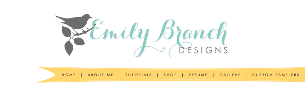
To make your brand recognizable you need to remain consistent in the design of certain elements like logos and headers. Your brand should be available amongst social media platforms like Twitter, Facebook and others. You also want your brand to remain consistent across multiple platforms, so it's recognizable. See any consistency in my branding above?
These are images from my headers here and on my Twitter page. The bird and branch are a consistent motif (from when my blog was Branch Out Designs), but I also carry out the name across all social media platforms. A consistent header, logo and name are vital in creating a strong and recognizable brand.


You still with me? Were at the last tip for blog design, and this one is the simplest one to do (when compared to designing a blog). Buying your domain is one of the easiest ways for people to recognize you and find your blog. An added bonus--when you own your domain, you actually own your content. Hosting sites like blogger, where your address ends in blogspot.com, technically own your content, even if you've designed it. So, by buying your domain and moving your content to it, you officially own all the content. Plus, I think it makes your blog seem a little more official and professional.
When buying my domain, I wanted to stick with my blog's name, but that domain was 1. Too expensive, and 2. Not available for another two years. So, I made the decision to buy a domain that was affordable and available, thus Emily Branch Designs. It's not the matching blog name and domain name that's important, it's the fact that you own the domain.
I hope you enjoyed the first post in my new series, Better Your Blog and Brand. For the next post I'll be discussing the basics of social media, and how to use them most effectively to better your brand. I hope you'll join me.


can't wait to read more! Thanks for the tips!
ReplyDeleteLove the resources you provided here! Thank you, very helpful. :)
ReplyDeletexoxo,
Jules of Canines & Couture
www.caninesandcouture.com
Great post! Thanks for the great tips!
ReplyDeleteGreat resources you've linked up, Emily!
ReplyDeleteThanks so much for this information and I hope you continue on with this series!
ReplyDeleteHelpful info Emily :)
ReplyDelete